Building a UI framework with React! aka Design system

Today, I asked my colleague Aashiq, “when was the last time you wrote CSS?”
Aashiq: “hmmm… its been a long while, I didn’t have to write; our visual components solved most of the problems!”
We have been building a framework to help our engineers deliver features faster without affecting the quality of the interface, we called it visual components. Visual components are simple React components which define color and structure of the app. Some people call it design systems or as ‘UI framework’, like Twitter Bootstrap. You may wonder why build a new framework when there are many popular frameworks available? When the product evolves, it creates patterns and behavior which developers have to replicate in every feature. This is grunt work and slows down development. Also, when the behaviors change, it becomes harder to update in multiple places across the app.
What are Design systems?
Design systems are like UI frameworks on steroids. Design system removes the cognitive load on the engineers to decide which class/style to use, it defines the building blocks of the application. It will ensure engineers don’t have to write styles while developing features.
A simple example would be, typography. There are multiple ways of styling a simple text with millions of color and size. Its impossible to make it consistent without a design system. Text component is one of the basic components of design system, with basic properties like size, color, and font weight.

Building a reusable visual component
Let’s look at a simple example of a title.

We can convert this to a reusable component.
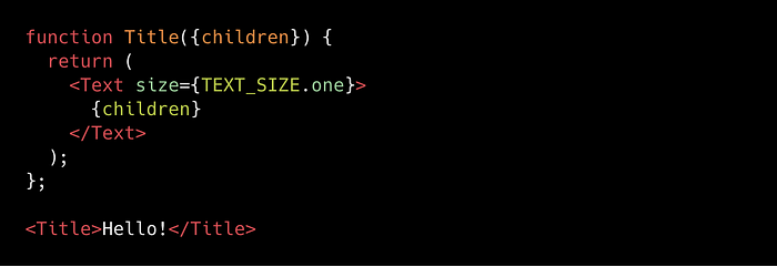
This reusable component will provide flexibility to change the behavior of a component easily and also makes it easy for developers to use it. Whenever a new requirement comes with a new style for the title, all we have to do is to modify the corresponding component to achieve the behavior!
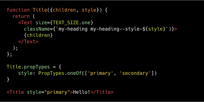
This Title component now takes a style as prop. The style prop adds a new class my-heading-style--primary, which you can use to style the component.
It’s important to not use props value which define the visual styles like blue, red, as these styles may change later. Instead, if you define the values as primary, secondary and where to use these components, we will be able to scale the use of the component. This also helps in self-documentation and it makes the engineer’s life easy!
Basic components of design systems are
- Text
Handle all the typography and should be using it across the app. - Space
Handle spaces between the elements, vertical, horizontal or around. - Color
Handle color to text, icon, etc - Button
- Form
- Grid
Check out a simple login page build using visual components https://codesandbox.io/s/zl18zy21kl
Things to keep in mind
- Design system is a collaboration between the designer and the developer. Issues will arise, when designers are not involved in the process of building design systems, right from the start. It’s important that designers and developers have a common understanding of components and props. The designer should be able to say “Use the Title with secondary style.”
- When developing a component you need to make sure you are not adding too many properties, adding too many properties will confuse the developers.
Example, let’s say there is a Button with normal-casing, now there is one scenario where the Button should have upper-casing! Instead of creating a new prop calledupperCaseit should be treated as a new style, saystyle=primary-alt - Design system should evolve over a period of time, it’s not something you build once and it works forever. It will evolve depending on technology, patterns, behavior, and use-cases of the product.
- Components should not have any business names. When a component is built with a business name, it becomes non-reusable.
Design systems fail when there are too many choices when developing a feature
I have created a boilerplate code with react, redux and design system, Hope it will be helpful
https://github.com/Anenth/react-redux-design-system-boilerplate

